
Detail from ‘Pizza’ 2009 5.5x8” acrylic on board
New Painting: ‘Pizza’
The one problem, or should I say, ‘feature’ of my technique is that I can’t make anything lighter once it’s painted. I don’t use any white paint and have no way of correcting an error of that sort.
This means patiently building up layers of thin washes, carefully avoiding putting paint on anything that will appear white in the finished image.
‘Pizza’ clocks in at an absurd 419.5 hours. Lots of darkness in the image, lots of detail. Things that make my paintings take a long time. Makes me want to do a white building in the snow next but I don’t have any winter images from which to work.
With winter finally entrenched in Montreal, I’ll have to head out with the camera and see what happens. In fact, I have a particular white building in mind!
‘Pizza’ is my first Montreal image. I seem to have successfully managed the mental transition to the new place I call home.
I took the photo over a year ago, returning to a place I’d been (without my camera) several months before. I was thankful the sign was still there but then, this is a part of town that isn’t exactly booming.
There too was the same guy (or someone just like him) in front of a tattoo parlour, having a smoke, fixing me with a bemused smirk. I was too annoyed by his ‘I own the sidewalk’ stance to let him put me off.
Admittedly, this is the kind of thing that usually does put me off but I said to myself ‘Artist at work, pal!’ while I took a couple of photos.
As I leave the scene, I usually feign interest in some random object across the street or look at my camera as though checking its settings. Avoiding eye contact at all cost!
I have fantasies of an empty city in which to photograph. No cars parked in front of houses. No guy on a cell phone standing in front of the only store on the block you want to shoot.
On foot, I’ve circled blocks waiting for people to clear out or for cars to leave the twenty minute zone they’ve been in for half an hour.
One would think that after sixteen years of this, I would have sorted out a painless routine for picture taking but it remains something I do out of grudging necessity rather than pleasure.
The world is full of confused, irate store owners and stupefied, slack-jawed onlookers and they are legion when I leave the house with my camera.
December 22nd, 2009
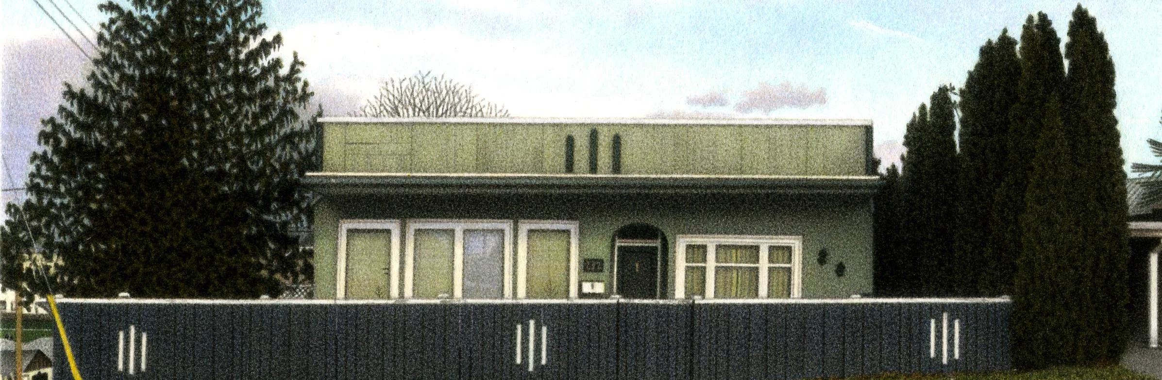
Detail from 100th Painting, ‘Burnside Road House’, 2007 5.5x8” acrylic on paper
100 Paintings
Occasionally the fog of the daily routine lifts and I take account of what I’ve been doing in the larger context of time.
Going through the lists I keep for completed paintings I noticed recently that I’d completed over a hundred paintings in the photorealist style. It seems almost unbelievable to me, given how slow my process is.
I can mark the beginning of my photorealist period accurately as I started doing them over the course of one weekend in 1993 after reaching the end of my patience with my former painting methods. It was a difficult decision making orphans of the paintings I’d spent the previous decade creating.
Projecting a photo, drawing it and painting it was the most fun I’d had in a long while and I loved the results. The process seemed miraculously transformative. I felt an objective detachment from the work for which I’d been unconsciously yearning.
The paintings in the video (not shown here) are presented in chronological order and without edits. Every painting I produced from 1993 to 2007 is represented. I find it interesting, in the video, that whenever I seem to be on an identifiable path I veer off into the woods unexpectedly for a painting or two.
I’d like to some day chronicle, year by year, the trials of my life as they related to the paintings I made, tying the two together in a psychologically informative way.
I still own almost a third of the paintings I produced in that period. Early sign paintings, the odd dud and the anomalies like ‘Manitoba Landscape’ and ‘Bride and Groom’. I jokingly refer to these as my ‘retirement fund’ but I’m not entirely convinced the assets will be worth anything when the day comes.
It’s taken a long time to figure out what and why I’m painting but I think I’m finally on to something.
Given that my paintings take longer to paint now than they did sixteen years ago I figure number two hundred should come around in about twenty years.
Stay tuned.
December 15th, 2009

View of Albany, from the bus. Photo, 2013
Refueling
The bus driver announced, as we were approaching the Albany N.Y. bus terminal on the way home to Montreal, that we’d be refueling the bus in Albany and stopping for food after another half hour on the highway.
He advised against eating at the Albany terminal saying he wouldn’t let his dog eat there. As the next food stop was scheduled to be at a McDonald’s I decided it wouldn’t kill me to go 10 hours without food.
The cajoling and herding of bus travel, the close proximity to people making odd noises and trying all manner of things to thwart the evil of deep vein thrombosis had almost completely overwhelmed the positive buzz of a few days in New York.
I thought when I moved to Montreal that I’d be in New York at least a few days a year but this was my first trip since the move. For me, it’s never hard to think of a reason why I shouldn’t do something. I finally came up with several compelling reasons to go and pulled the trigger on a trip.
My Montreal artist friend Randall Anderson was going down to de-install his latest project, a sculpture in a storage locker in Chelsea. An Internet friend, Adam Normandin, had a show of his realist work at George Billis Gallery and a far-flung group of photorealists who found me on facebook were arranging to meet for a gallery tour.
I had my doubts. I’m at a place where I’m a little confused about what I do. These mostly young photorealists appeared to be a gung-ho bunch and I was afraid of contaminating their enthusiasm with my growing distaste for the genre.
The trip however, became a lesson in refueling. It was interesting and affirming to see artists at all points in their careers becoming recharged from new ideas and the shared struggle of making art.
Recognizing each other from our tiny facebook profile pictures we greeted each other like long lost friends although our only acquaintance was from scant lines of information on the internet.
New York can be overwhelming for an artist. Chelsea is full of spectacle, the new, the novel. The soaring spaces often outshining the art.
But something always manages to touch the heart: Randall cheekily working the perimeter of the mainstream art world with his Manhattan Mini Storage installation ‘Chelsea Prototype’; My friend Jay Kelly’s obsessively created small abstract drawings at Jim Kempner; At Pavel Zoubok, John Evans’ one-a-day collages which for decades chronicled the concerns of his East Village neighbourhood through found bits and pieces.
This latter helped underline for me the importance of one’s work being about what one knows best.
For the first time in eight years of trips to New York, I came home without a single photo that I’d turn into a painting. It suddenly didn’t make any sense for me to even partially focus on the imagery of a city I know only through infrequent visits.
A week later we’re all back home and judging by the facebook postings, most are full of the excitement of new techniques to try, new art world connections, new art discovered and a few more of New York’s mysteries unfurled.
I’ve struggled through a week of post hangover, post nine hour bus trip blahs and look forward to starting a new week with at least enough gas to get me through my next painting.
October 12th, 2009

Detail from ‘Apartment on Convent Place’, 2009 5.5x8” acrylic on board
New Painting: 'Apartment on Convent Place'
I had originally wanted to shoot this building from the front where the word ‘Maple’ appeared on one of the front doors in plain, vaguely italic, gold leaf letters. The other door must have read ‘Apts’ or ‘Court’ but had been replaced. By the time I got around to shooting it, ‘Maple’ had also disappeared.
I had been intent on calling the piece ‘Maple’ and the missing word killed my interest in the building. Just another worn looking small stucco apartment in Victoria. The narrow street wouldn’t allow me to fit the whole building in my viewfinder so I left without a photo.
Some time later, overlooking a carport, I took a shot of the back of the building not realising it was ‘Maple’.
We’re settling in to Montreal but I’m still dragging out my most recent Victoria slides to browse through. Old slides have a diminishing impact on me over time, reflecting old concerns or conceits. There seems to be a two year window of relevance which I can feel closing on my Victoria shots.
I notice John Salt and John Baeder often use old photos for new paintings and wonder if I’ll ever do the same.
The changing nature of what surrounds us interests me. The changes giving new context to the old. The constantly shifting definition of ‘old’. I guess using old photos is one way of pointing out these changes.
God knows why I picked this image out of the pile. Like most, it sort of demanded that I choose it. I sometimes find myself mid-painting asking ‘Why on earth am I painting this?’ Nondescript is hardly the word but it undoubtedly reflects some subtle perceptual change in me and illuminates some dark corner of my psyche with its weak light.
September 17th, 2009

Detail from ‘Louise Apts’ 2008, 5.5x8” acrylic on paper
What’s the Point?
A question photorealists are often asked and in the silence of approaching darkness on our deserted street, a question I ask myself too frequently about a good many things.
With regards to making a painting from a photograph I can only say that it’s the best way I’ve found to express myself as an artist.
In an age when the definition of art is so broad I’m shocked that knowledgeable people still question the validity of photo-based paintings, giving it only the most superficial analysis.
At my second show of photorealist work in Toronto the first conversation I had on opening night was of the ‘what’s the point’ variety. It still galls me that the man with the question was a successful painter at the gallery who dismissively told me he could produce something similar to my paintings with photoshop and a printer.
By the time I had finished defending myself I was emotionally spent and not much looking forward to the rest of the evening. When I learned he was a ‘stable-mate’ I could have done the little bastard some physical harm!
It’s not always easy being the only photorealist at a gallery.
I don’t often meet the people who buy my paintings but at my last show I spoke with someone who had just purchased ‘Louise Apartments’ and was at a loss to explain why the image affected him to the degree it did.
The loss of words, his stock in trade as an English professor, gave me a feeling of task-completed. I detailed for him, as best I could, the initial encounter I had with the subject: camera in hand, a feeling in the stomach that is akin to dread or despair, to hearing that the news is as bad as you thought it might be.
The point of the whole excruciating exercise being something beyond words or description.
August 30th, 2009

Crate of paintings for my second solo show at O.K. Harris, New York, NY. 2008
Shipping
In my continuing effort to expose the minutiae of my painting practice, here are a few words and a small movie (not shown here) on shipping.
Equal to my hatred for framing is my hatred of crate assembly.
I tell myself that I wouldn’t hate it so much if I had a workshop but I once had a workshop and hated it just as much. Perhaps the shop’s small size was the issue, I couldn’t move an eight foot piece of wood without knocking things off shelves or gouging walls.
For someone as detail oriented as me I have the darnedest time with tape measures. The old adage of ‘measure twice and cut once’ is no guarantee of success. Power tools and an amped-up level of frustration aren’t a good mix.
A huge part of the stress of shipping is the possibility of the complete destruction of one’s paintings. Covering an obsessively created work of art with a thin layer of glass for its ‘protection’ for a cross continental trip is a little counterintuitive but things can be done to lessen the chance of disaster.
Using blue painter’s tape (made by 3M) I cover the glass with a grid which, in the event of breakage, is meant to hold any broken bits of glass in place until they can be dealt with. The glass is supported somewhat by the mat board surrounding the painting so the unsupported area is quite small. Incidentally, the green versions of this tape leave adhesive on the glass after a short period.
I’ve managed not to break any glass in ten years of long distance shipping so the inherent danger might be less than it would appear.
I wrap the framed painting in a plastic bag, making it as water tight as I can.
Bubble wrap is my best friend. I could be accused of overusing it but anything wrapped in a sufficient amount of bubble wrap will survive all but the most catastrophic incidents. I once used 150 feet of bubble wrap to send a crate with fifteen paintings to New York from British Columbia ...and they survived.
It wasn’t the most efficiently assembled package I’ve ever shipped.
I buy one inch bubble wrap in two hundred foot rolls. The last roll I purchased I had to strap to the roof of my miata, dwarfing the car. All that was missing was a ‘follow me to the circus’ sign taped to the bumper. The salesperson at the store said that if it fell off the car at least no one would get hurt!
The crates themselves are made of quarter-inch plywood attached to external frames of one-by-two strapping. I use drywall screws to hold it all together
When I send a single framed painting I make the sides of the crate with one-by-fours topped with quarter-inch sheets of plywood
I seal all the edges with packing tape, address it and hope for the best.
My friend Steve Donahue shared with me the unique method he once employed as a UPS driver on the graveyard shift in Toledo, Ohio. Being somewhat anti-authority, Steve, annoyed by the supervisors checking out his adherence to the standard ‘how-to-pack-a-truck’ policy preferred to build a well constructed false wall and pitch all the remaining boxes into the darkness beyond! He gave special attention to boxes marked ‘Fragile’.
Unfortunately, he shared this on the eve of the shipment to New York of my first show at O.K. Harris: twenty thousand dollars worth of glass covered paintings, representing half a dozen years of work, awaiting the arrival of the distinctive brown UPS truck!
August 9th, 2009
(It should be noted that since about 2011, I’ve used UV Plexi instead of glass in my frames.)

Detail from ‘Camrose Apartments’ 2005, 5.5x8” acrylic on paper.
Perfection
Maybe today will be perfect.
This means I will begin painting at 9 am, I’ll stop at noon for lunch, I’ll continue painting at 12:30 pm and stop again at 5 pm.
No one will call. No one will need me. I won’t need to make an appointment to get my summer tires installed or notice the tiny burgeoning of a recurrence of skin cancer on my forearm.
I’ll be so seduced by the desire to make something perfect that I won’t notice the inanities of the radio blaring in the background.
One of the reasons I turned to photorealism was the temptation of perfection.
If I make the painting look just like the photograph I used as a source then I have, objectively, achieved one of the things I had set out to do.
You may not like what I painted or why or how I painted it but you sure as hell can’t tell me it doesn’t look like a photograph.
When you’re insecure or unaware of what you’re saying in your paintings it’s easy to become bogged down by the pursuit of perfection.
Perfection is an illusion. The siren song that lures me from the realities of my existence.
After my second sold out show in New York a noted authority on photorealism called my work that of ‘a fine journeyman realist’.
Ouch! After all, the sold out show wasn’t at his gallery.
I’m beginning to understand that the pursuit of perfection is an unsuccessful effort to eliminate any possibility of rejection and at the same time a denial of the humanity in my paintings.
My eyes, my brain and my hands work together in their own unique way. The imperfections are what make the works unique to me.
I’m human and I cannot be perfect. Repeat as needed.
July 28th, 2009

Detail from ‘Martin’s Bar’, 2006 5.5x8” acrylic on paper.
The Subject
What do I paint?
I used to ask myself this before starting a painting. I’d go through slides of my recent work and remind myself what it was that I painted.
I think it’s one of the harder things for a photorealist to consider, we’re defined so much by the things we paint. I’ve ended up being more enamoured of painters who aren’t as easily defined by their subject matter. How do you describe what Robert Bechtle or John Salt paints?
When I dropped old neon signs as a subject I had only vague stirrings of awareness of the direction I was headed. The conscious changes one makes are usually dead ends. There is often an undercurrent of change that’s more elusive but more important to identify.
How do you carve out an identity as an artist without figuring out who you are as a person? I am singularly unmoved by paintings of marbles, random objects in glass jars, the still life of vintage collectibles.
What do these things say about one’s soul? Not much.
When I look at a painting, I want to be let in through a crack to the artist’s psyche, not to simply marvel at their technical bravado.
Far more difficult than the mastery of technique is the seeming endlessness of the artist sorting out why he paints. Why he paints what he paints.
For the photorealist, it’s worth considering why one chooses to be a photorealist at all. Why would a sane person do that to themselves?
I don’t know that it’s ultimately necessary to have this knowledge but I know that it’s important to ask these questions of oneself and to answer them truthfully.
The questions never change but for me, the answers continue to morph and shift in unexpected ways.
What do I paint?
If I’m figuring anything out, I’m painting an honest reflection of myself.
July 13th, 2009

Detail from ‘M. Griffin Ltd’, 2009 5.5x8” acrylic on board.
New Painting: 'M. Griffin Ltd.'
My first painting on archival illustration board (Strathmore 500 series- Heavyweight Plate, to be exact).
I’ve been encouraged by the gallery for a couple of years to try out illustration board. In the strange world of art dealing, I can get more money for a work on board than I can on paper.
I stubbornly resisted the suggestion for no other reason than stubbornness and wish I had made the switch sooner.
There is little or no change in technique needed and it’s a smoother, brighter surface. It’s also more amenable to being tossed around on the table as it’s considerably thicker than the 300 lb Fabriano Artistico I’ve been using for most of the last decade.
I’m glad it’s worked out. In order to buy it locally I had to buy two packs of board. As I left the store, it dawned on me this was an eight year supply.
Undoubtedly one of my last few Victoria, B.C. subjects, M. Griffin Ltd. is located around the corner from my last address in downtown Victoria.
Aside from being easier and quicker to paint, I love the look of white stucco buildings. I was struck when I arrived in Victoria in 1989 by the lack of brick buildings on the west coast. Stucco rules the day!
The omnipresent grey sky of winter makes these old white buildings stand out with a certain shopworn serenity.
I finally got around to photographing M. Griffin just before we moved. I had been meaning to paint it for years and had originally imagined it with the late evening summer sun on it. I’m glad it ended up with the blah, late winter blues. Very wet-coast.
My friend Wilfred in Vancouver said that he was curious to see how living in Montreal would change my work. At first I thought ‘Not at all!’ but as we complete our first year here I realise there will have to be a bit of a shift.
Montreal presents some interesting challenges for me. The most obvious being French language signage. A painting of a storefront in Victoria could represent anywhere in North America. Do I want to be so specific as to say ‘This is Quebec.’ in all of my paintings?
We had a particularly brutal winter this year and I wasn’t moved to take any photos. Can I possibly ignore the way things are in Montreal for almost five months of the year?
These days the city’s alleys are seeping in to my consciousness. Having moved to my sixth address in five years, this time to a loft in ‘Petite Italie’, we find ourselves surrounded with alleyways, train tracks and any manner of oddball light industrial building. The daily dog walks are serving to indoctrinate my mind to the new vernacular.
Part of what I think is important in my paintings is my connection with the subject matter. It seems inevitable that I will find a way to connect with the city I live in and I don’t want to pretend that I live somewhere else.
I’ll likely continue to mine the old photos for a while. I have one or two more Victoria shots and the inevitable gold mine of New York to tide me over until the indoctrination of the new is complete.
June 30th, 2009

Chelsea Lodge, New York City, 2011
The Photograph
Despite the clear headed, objective nature of the photorealistic process there is an intuitive side to the work, namely the taking of the photograph.
I can be in an anxious state when I’m out in the world and this seems to heighten the subconscious attraction I have for a subject. Exhaustion will do this as well: many of my photos are taken on very long walks whose sole purpose is to find subjects for paintings.
I’ll find myself raising the camera to my eye without much thought. I don’t ponder or deliberate, don’t analyse the scene in any way. I just shoot and move on.
When the film is developed, I often find some key element in the image of which I had no conscious awareness when I took the photo.
I occasionally pass up a good photo in order not to stop in front of someone or otherwise draw attention to myself. I sometimes counteract this self sabotage by telling myself that taking photos is a necessary part of my job and when I have my camera, I’m working.
It always seems that the only truck on the street is blocking the one building I want to shoot or the guy on the cell phone won’t vacate the doorway in that perfect shot.
The inevitable passerby always seems perplexed that I would take a photo of some decrepit building. Little do they know I might also spend the next several months making a painting of it.
Like most of my process I’ve tried to keep this aspect of my practice simple.
I use a fifteen year old Minolta SLR 35 mm camera and shoot with Fujichrome Provia film. I haven’t spent a lot of time experimenting with film. The Fujichrome has a nice, even tone and is readily available to me.
I use the camera in full-auto mode with its standard 28-80 mm zoom lens. Simplicity relieves the awkwardness of busy city streets. I can frame with the zoom, press the shutter and be gone.
I take only two photos of most subjects, trying to ensure that I don’t crop the image too closely. I can alter the framing when I project the slide.
My tendency is to centre the subject in the viewfinder. There is something I find more objective in the symmetry of such an image. I’ve become suspicious of the apparent dynamism of diagonal lines!
It probably just appeals to my desire to seek order in my surroundings.
June 22nd, 2009

Time Sheets, 2009
Time-Sheets
Curiosity drove me, in 1997, to record the number of hours I spend on each image I paint.
I began to keep the little cards on which I record the numbers thinking they were an interesting artifact of my process.
It helps to know how long it takes to complete the average painting when planning for upcoming shows. It’s also enabled me to passive aggressively imply to galleries that my paintings are being given away, considering how long it takes to paint them.
I can also torture myself with the fact that the paintings are now taking four times longer to complete than they once did.
In a continuing effort to expose my painting methods I began sending copies of the ‘time-sheets’ to O.K. Harris with the paintings in 2005 and now affix a copy of them to the back of the framed painting. I’m not sure what anyone makes of them.
For the statistically minded, the longest I've spent on a painting was my most recent: ‘Parkside Bar’, 2009, 8 X 12” at an astonishing 682 hours.
The most time consuming image for its size was ‘Munt’, 2007, 8 X 5.5” at 387 hours or 8.8 hours per square inch!
Not that I’m counting.
May 29th, 2009
Detail from ‘Parkside Bar’, 2009 8x12” acrylic on paper.
New Painting: 'Parkside Bar'
‘Parkside Bar’ is in New York’s suddenly not-very-scary lower east side. I took the photo for the painting while on a mammoth, early morning walk a day or two after my last opening in New York.
I’m always tempted to do a larger painting in the months after a show. In my case, a twice-than-normal-size ‘larger’ painting is a mere 8 X 12”.
‘Parkside Bar’ was begun as our first winter in Montreal descended upon us.
After nearly six months I’ve emerged, blinking at the brightness, to deal with my peculiar post painting anxieties.
Towards the end of a painting I begin to feel a vague unease which inevitably turns to general agitation. I’ve never tried to analyse this process because it goes away once I’ve started another painting.
My girlfriend Hayley implied the other day that I use the paintings as a refuge from the world. In the case of ‘Parkside Bar’, a six month removal from any concern other than painting.
After the brief, sullen silence that followed, I agreed that she was right. I deal with all the unpleasantness of life in the days following the completion of a painting, saving it all up for the week or two until I begin to trace the next image. Documenting, framing, shipping, the doctor, the dentist, the vet, taxes.
The dread becomes understandable in this context. Whether or not I can do anything about it is another matter.
April 17th, 2009

Ken Danby - ‘Lacing Up’ 1973, Alex Colville - ‘June Noon’ 1963, Christopher Pratt - ‘Institution’ 1973, Edward Hopper - ‘Excursion into Philosophy’ 1959
John Baeder - ‘Diner - Camp Hill, Pa.’ 1973.
Kill Your Idols!
I’ve always believed that people can be hindered by their idols.
It’s natural to idolize and to aspire to the achievements of another but at some point, in order to have any hope of a similar or greater success, you have to believe you are at least their equal.
I’ve looked up to several artists throughout the various phases of my growth as an artist.
It strikes me that I’ve gone through several stages in my attitude towards them as one does with one’s parents throughout the phases of growth of the individual.
Stage one is undying love and admiration.
Stage two is the opposite of stage one.
Stage three is a more reasoned appraisal based on more or less rational thought.
***
In my early teens the two things I loved most were hockey and drawing. I was, therefore, an enormous fan of Ken Danby ('Lacing Up'-1973).
Stage one:
I am most enamoured of Danby's hockey images 'At the Crease' and 'Lacing Up'. His scenes of rural Ontario feed my imagination for the countryside, a romanticized notion borne of my lack of experience beyond our North Toronto neighbourhood.
Stage two:
The early evocative images of rural Ontario give way to artistically questionable commissions and furry kitten sentimentality. He seems not to notice the difference between brilliance and schlock.
Stage three:
His early paintings hold up as a sensitive record of nineteen-seventies rural Ontario. ‘At the Crease’ remains an icon and while I wish his later postcard style images of Lake Louise, etc. held even the slightest hint of irony, he had a particular vision for his art that held strong through several decades until his death in 2007.
***
Phase two of my growth as an artist is marked by my interest in Canadian east coast painters Alex Colville ('June Noon'-1963) and Christopher Pratt ('Institution'-1973).
Stage one:
The realists to whom one graduates after Danby infatuation. Both play on a darker vision of rural life: undertones of violence or other threats concealed in the depiction of the everyday. Colville presents his subjects with a palpable sense of foreboding and angst.
A sense of alienation permeates Pratt’s spare, linear compositions.
Stage two:
Neither artist excels at the human figure. Colville’s subjects are often awkwardly posed and the number of images with obscured or turned heads leads one to think he can’t paint a face.
Pratt’s figures appear as lifelike as a silicone skinned robot.
Stage three:
Both artists have, over several decades, produced an astonishing, complex chronicle of their lives and environment. Pratt’s work has become darker and more psychologically intense and both are deservedly Canada’s best known realists.
***
Phase three is my introduction to Edward Hopper ('Excursion into Philosophy'-1959) through the book by Lloyd Goodyear. I remember unpacking it at the book shop where I worked and being amazed that a realist had painted urban scenes in the nineteen-thirties and forties.
Stage one:
I had a great interest in depression-era America in the early eighties, the cars, the buildings, the clothing, the literature and here was Hopper providing me with the visuals.
Such was my fear of overt artistic influence that I stopped reading the book ‘Edward Hopper: The Art and the Artist’ by Gail Levin because I identified too much with Hopper’s stubborn personality.
Stage two:
As bored as I am with my own work in the early nineties I am equally bored with the parade of sad-sack characters in Hopper’s gloomy canvases.
Stage three:
I’m still moved by Hopper’s quietly haunting images of post depression-era America and by his steadfast adherence to an out of favour style in a turbulent time for American contemporary art.
The timelessness of his concerns allows the work to be as effective today as ever.
***
Odd that none of these artists are photorealists.
They held my interest but I had no desire to produce such work nor the confidence that I could.
I was, however, mildly obsessed with John Baeder’s anecdote-filled book ‘Diners’ a couple of decades before I had any inkling that I’d end up showing at his New York gallery. I admired and envied his all-consuming interest in his subject and read through the book several times. (Diner- Camp Hill, Pa.-1973)
I had the good fortune to have my second show at O.K. Harris in 2008 alongside Baeder’s twelfth show.
I brought my old ‘Diners’ book to New York thinking I’d get him to sign it but as I made my way to the gallery for the opening, the book in my shoulder bag, I wondered why I wanted his signature.
When I arrived at the gallery I put my bag, the book inside, in the lunchroom closet where it remained for the duration of the evening.
I realised what I wanted when, later in the evening, he shook my hand and said how much he admired my work.
April 8th, 2009

Holding a Slide Viewer, Montreal QC, 2009.
Practice
My methods are as simple as I can make them. I’d rather paint than research materials or experiment with techniques.
My ‘studio’ is a sixties green metal office desk.
I keep my paint in one drawer and the painting I’m working on in another.
Most recently I’ve painted on Fabriano Artistico 300lb hot press watercolour paper.
I use a number six gold sable brush which I change once a year.
I use six colours: Liquitex cobalt blue; Liquitex brilliant blue; Liquitex cadmium red medium; Stevenson permanent crimson; Liquitex cadmium yellow deep; Liquitex mars black.
Each watered down colour is in a small glass jar whose lid, an inverted yogurt container, also serves as its palette. Colours are occasionally combined in other containers.
I project a 35 mm slide of my chosen image with a thrift store projector and trace it directly to the paper. I refer to the same
slide using a hand-held daylight slide viewer when I paint.
The paint is applied to the paper in thin washes, background to foreground, light to dark. As in traditional watercolour technique I let the white of the paper provide tints and highlights.
I cover all but the area being painted with tracing paper so as not to expose painted areas to accidents and to protect the light pencil markings on unpainted areas.
The average 5.5 X 8” painting can take upwards of 300 hours.
At the end of my nine to five day I put everything back in its drawer.
March 21st, 2009